
Client
| Cebu Pacific Air
Task
| Refresh and modernize the brand’s visuals.
Now that the pandemic restrictions have been lifted, people’s desire to
travel came back. But now, after being kept indoors for a year, there’s a
heightened appreciation for all aspects of travel. Heck, even falling in
line is now nostalgic!
Cebu Pacific, the Philippines’ largest LCC, wanted to start a brand love
campaign. We want to touch on the enriching qualities of travel, to make
Cebu Pacific’s role as a travel enabler more meaningful- without losing
the fun aspect. We created a campaign talking about every ‘Juan’- which is
a pun of ‘one’ and also means a regular Filipino. We asked if they are the
‘Juan’ who: Loves to travel, who’s raring to go, who’s itching for a new
selfie, to meet new people, and even meet the ‘juan’.
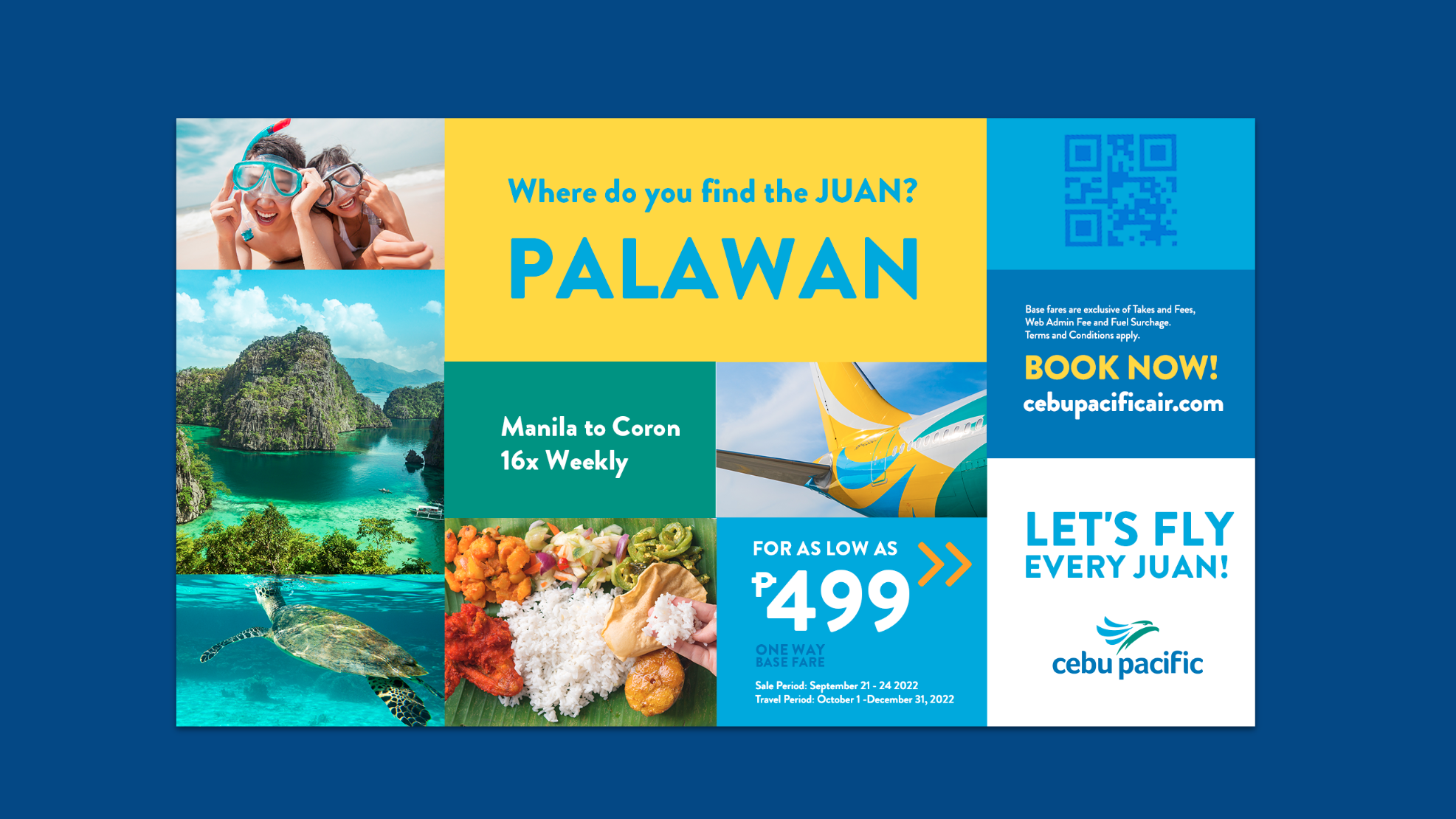
To launch it, we did a visual refresh on the materials, creating a fun and
modern look (and not your usual airline ad), ranging from OOH, lamp post
banners and seat sale ads.


The visual style feature several, free to move blocks that feature a mix of copy, vectors, photos and logos arranged in a colorful, dynamic way.


Copyright © Natassja Velasco. All rights reserved.